Delivered a recommendation-driven buying experience that simplified bundle discovery and increased cart attachment for sleep category products.
Improved
Cart Attachment
Guided
Decision Path
Reduced
Abandon Rate
The Challenge
Parents shopping for baby sleep products faced an overwhelming selection with no guided path — leading to decision paralysis and high abandon rates on category pages.
The Solution
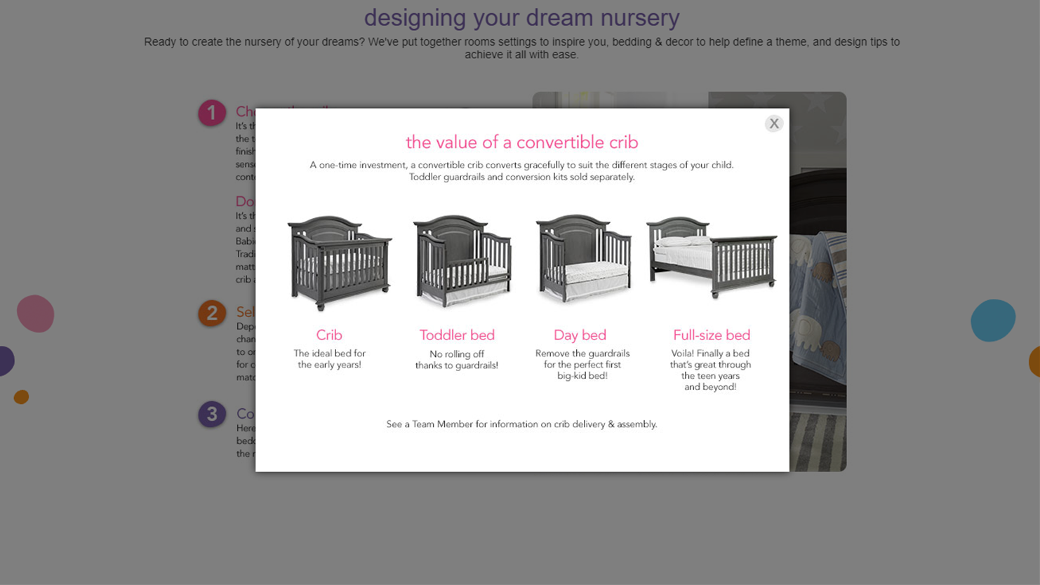
Designed a Sleep System guided experience that used product data, color/style preferences, and safety requirements to recommend bundles — turning a complex purchase into a confident decision.
Service Scope
UX Design
Data-Driven Recommendations
Category Experience Design
Project Gallery
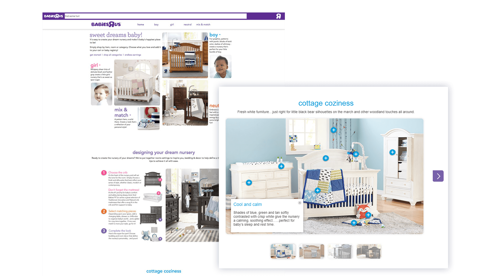
Responsive Interactive
Chapter one
All projects were responsive by default.
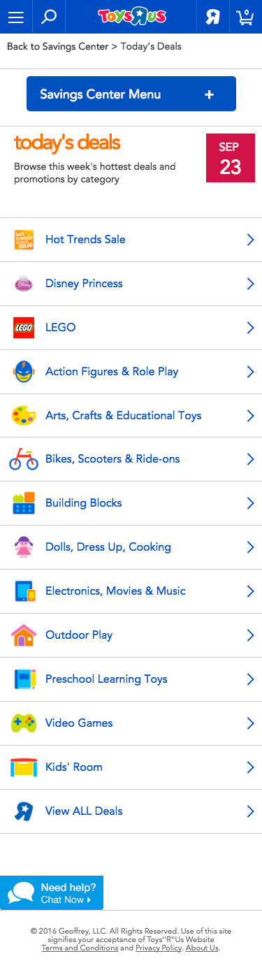
Mobile View
All about Data
Chapter two
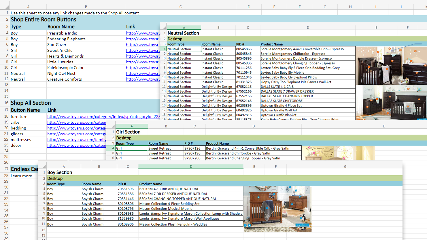
Formatting Data
The Merchandising, Marketing, and Creative teams created the curated combinations offered within this experience. Every month, they would compile all the data and assets into an Excel spreadsheet. Manually coding up this experience would be very time-consuming. I took their spreadsheets and formatted them into a new Excel document that was clearer and easier for them to update.
Using Data
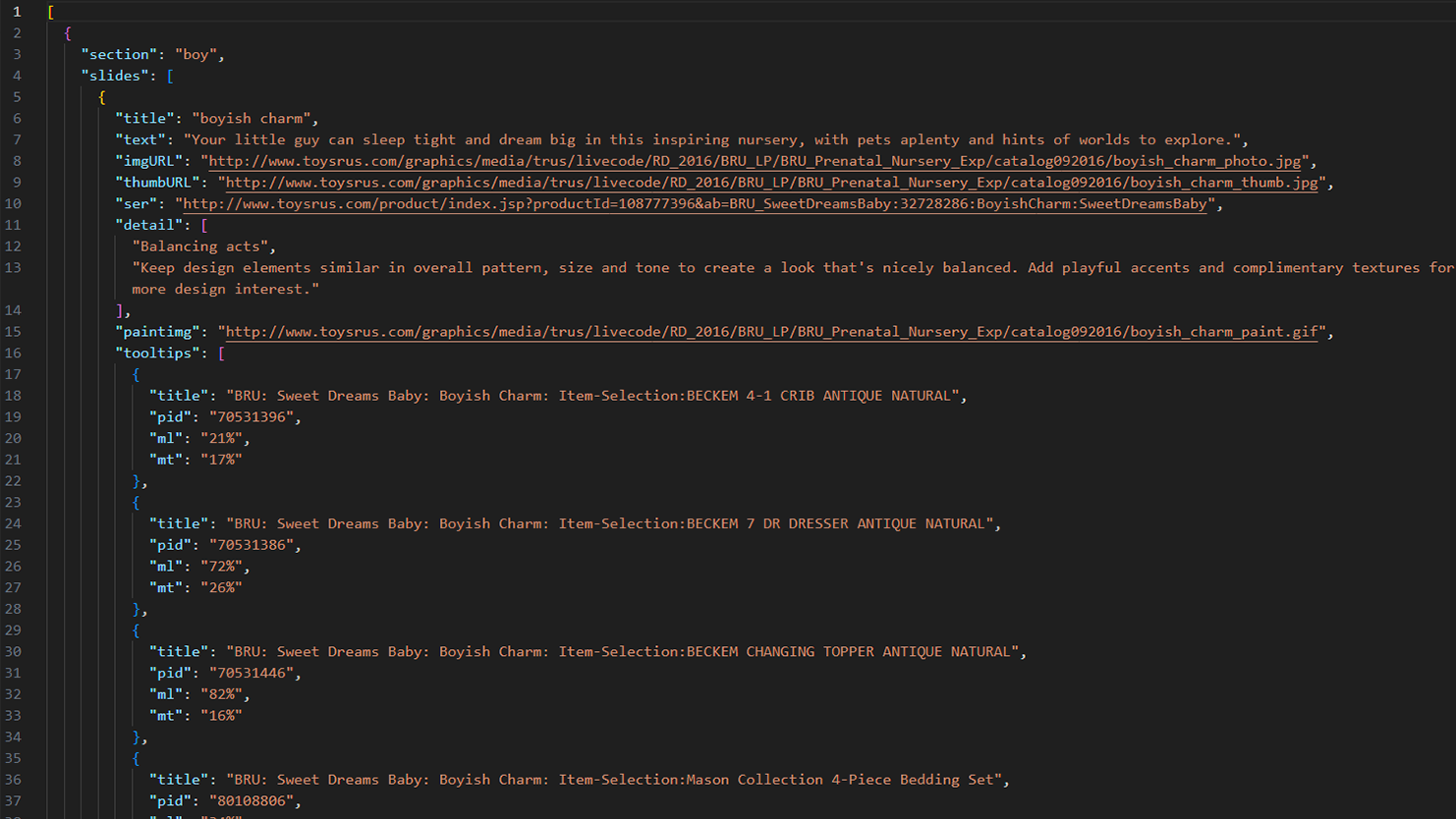
With the help of a talented developer team member, we created built-in macros to convert the spreadsheets into JSON data. Once formatted, I was able to take that data and write a Javascript engine to generate the experience. We automated as much of the process as we could, making production simpler and easily repeatable!
Now that I have the data structured, I can use it to create what was designed. Fortunately, the designers trusted me and were willing to adjust the designs based on my feedback and these sketches. It allowed everyone to understand the underlying functionality and what would be needed from each team every time we had to update the content.
Bells and Whistles
Chapter three
Bouncing In
We begin the experience with a gentle bounce of our categories, tapping into the bouncing baby energy our customers are eagerly awaiting. I create most of my animations with CSS in order to reduce the need for external libraries that would increase load times on the site.
Inside Info
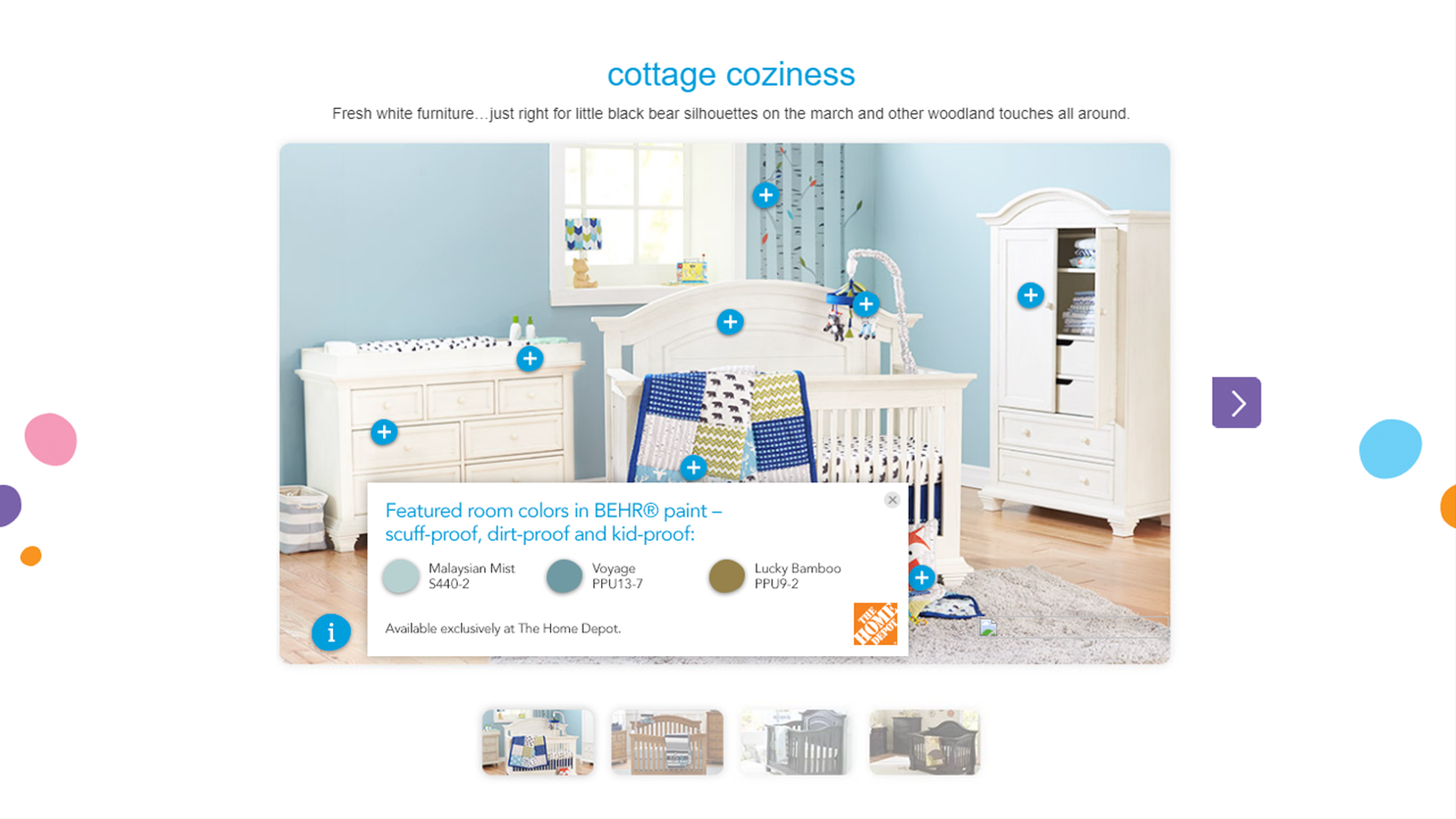
When a customer clicks on the "i" icon at the lower left, they get an overlay with a creative description of the theme. This provided useful information on why the colors were selected for this theme.
Get those Colors
Clicking on the paintbrush button on the lower left triggered another overlay. In partnership with Home Depot, we provided the brand and colors of paint used in the theme so customers could easily recreate the theme for themselves.
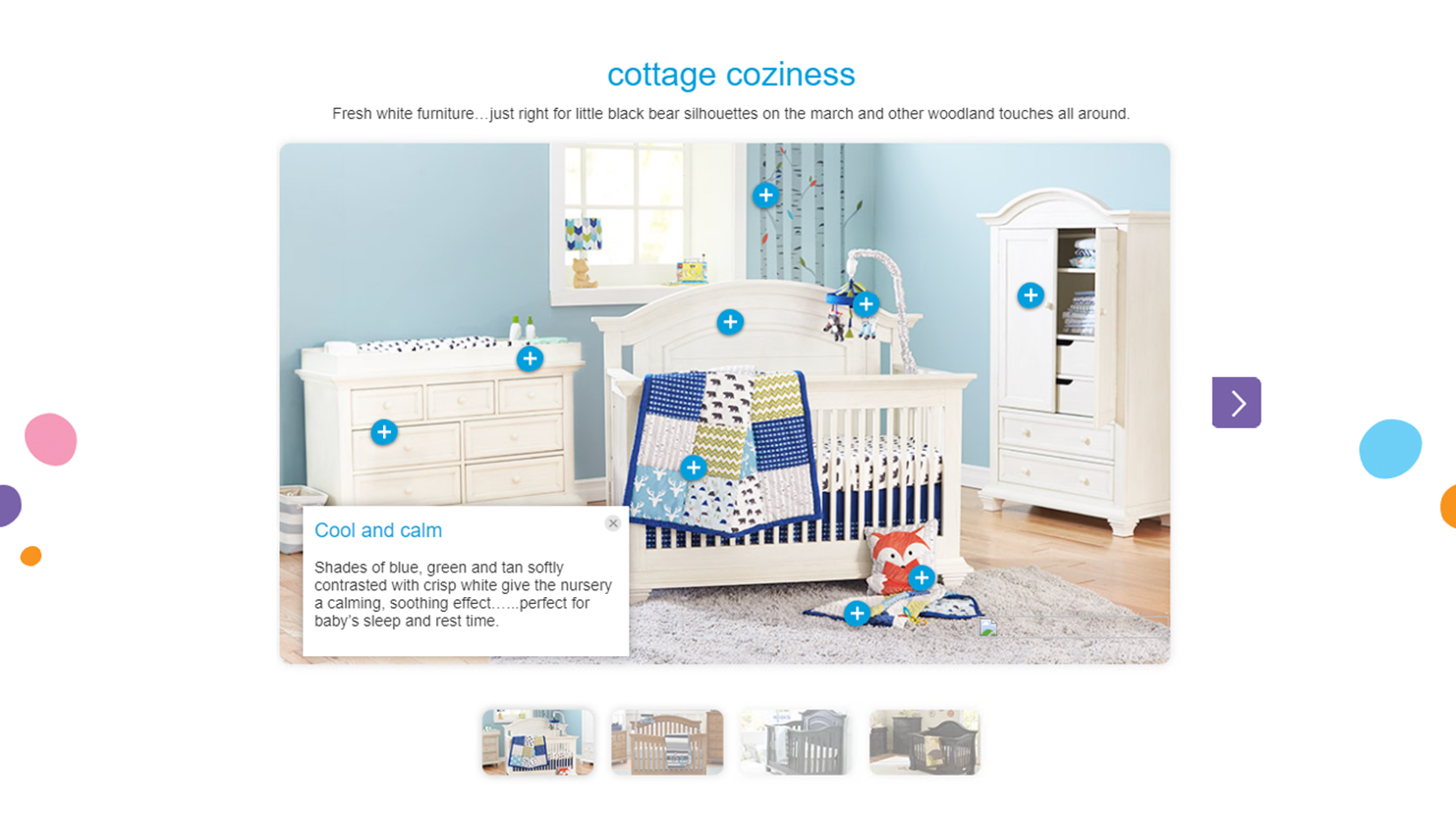
Plus Icons
The primary content is found within the + buttons dotting the main image. Each one launches a popup that taps into the catalog API, bringing in product information and the ability to add the item to the cart.