Delivered a more coherent search experience that improved member confidence and reduced friction across the destination comparison and booking flow.
UX Designer • 2018–2020
Improved 22% YoY
User confidence and satisfaction
Cost savings
Using existing technology better
Modernized look
Redesigned view modes
The Challenge
RCI's resort search was fragmented across filter types and map/grid views, making it difficult for members to confidently compare and book exchange destinations. The page loads were long and when 0 results were returned, increased frustation significantly.
The Solution
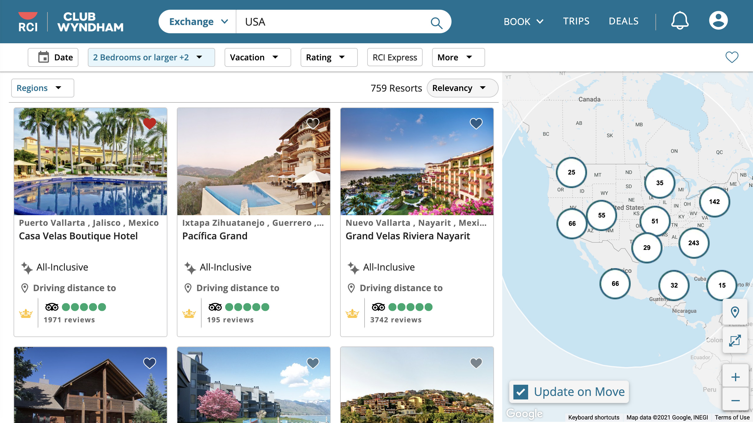
Redesigned the search experience with unified filter panels (date, region, type, unit), a split map/grid view with hover-driven product cards, and improved cluster handling for map-heavy results. I also had the filters show a count of possible results so a user would know that their filter selections would provide results or not before applying them and showing the resort cards.
Service Scope
UX Audit
Interaction Design
Filter Architecture
Map UX
Stepping Up
Chapter one
“To be honest, working with you on search kinda blew my mind.”
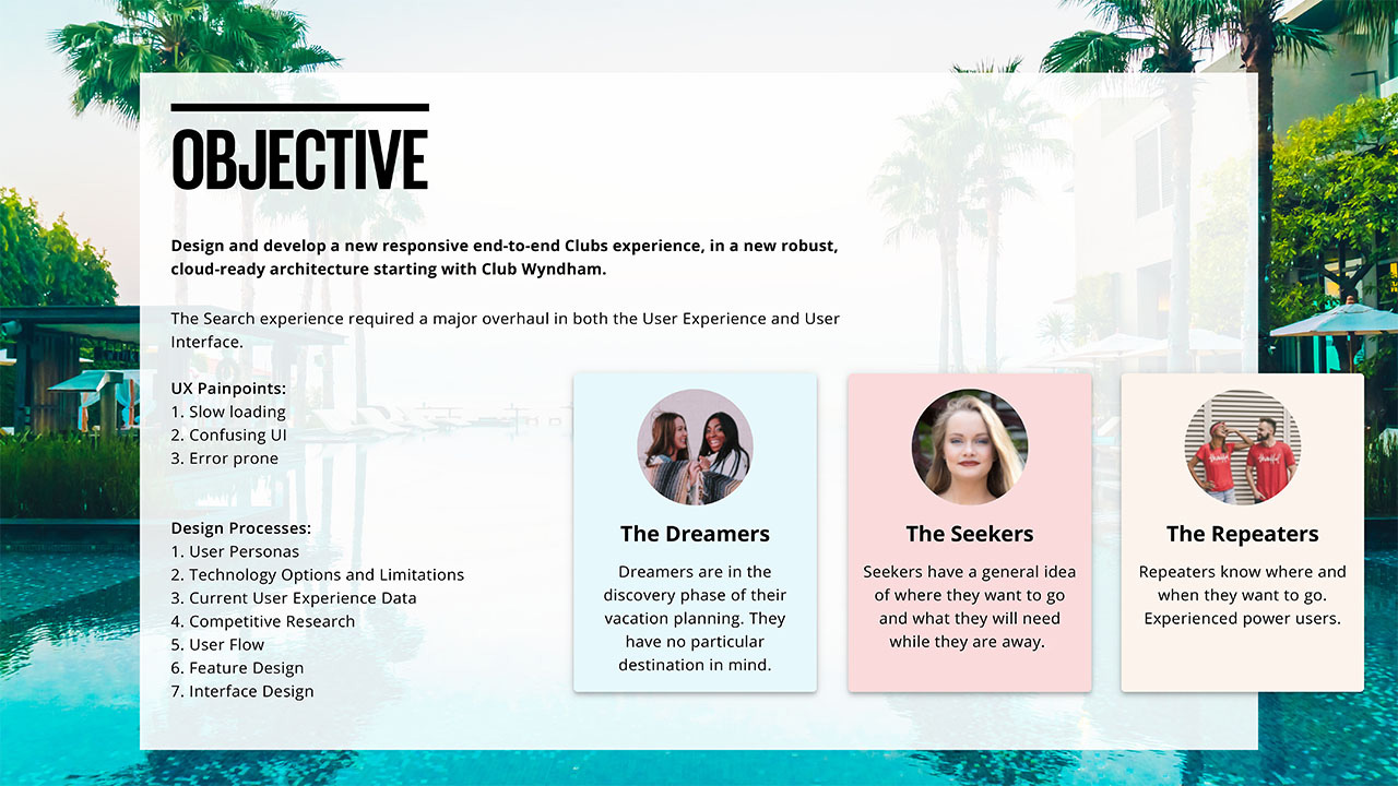
While working on the RCI Design System, my supervisors asked if I would be willing to take on the Search project because it required a deeper technical knowledge. I eagerly accepted the challenge for two reasons: 1. Search is a significant feature of the application, and I can implement a higher-level UX process; and 2. I can use my new Design System and really test its capabilities for myself.
Comprehensive Review
I split my UX investigation into two parts: Platform and Data limitations and User Experience feedback and flow. Knowing what the platform can and can't do allowed me to craft user journeys that best use it. Secondly, knowing who the users are allowed me to leverage the platform on their behalf.
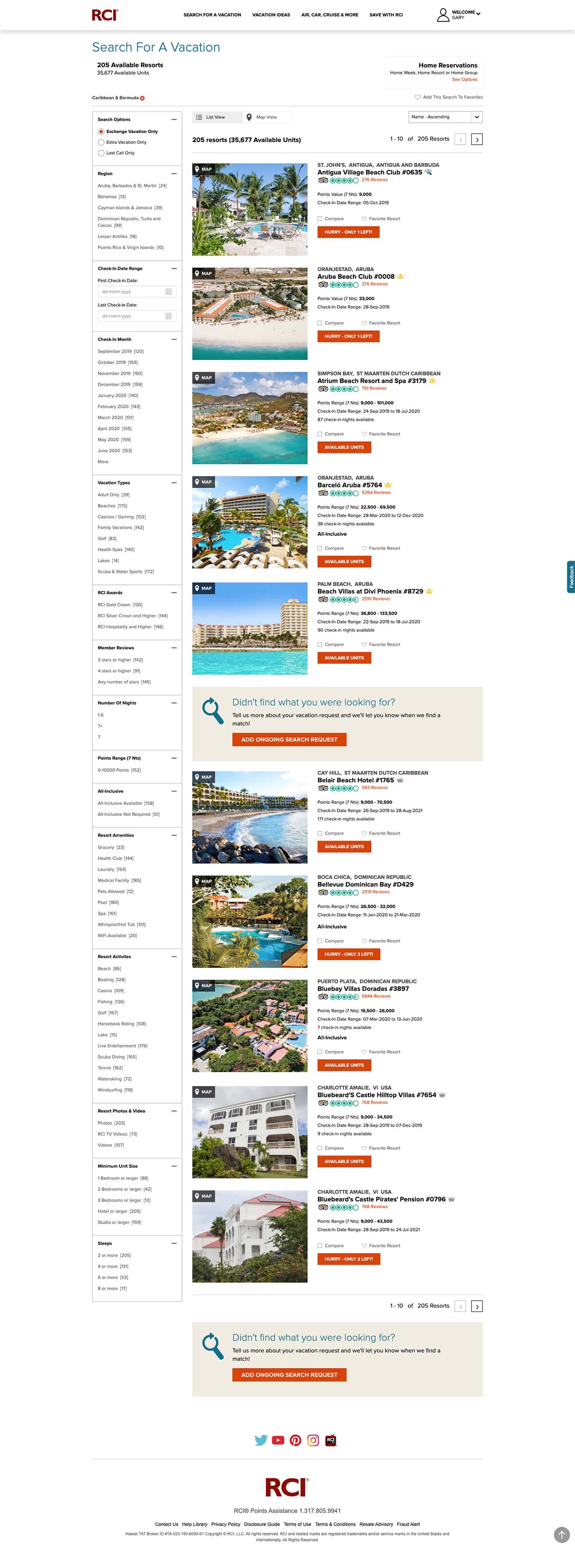
Legacy Search Experience
Chapter two
The legacy search experience had become outdated and was unresponsive. The page load was slow, and you could not see anything until the page loaded completely. Users had to scroll down the entire page to see what filter options they had available to them, and those options were dynamically generated. Users had to rediscover filter options with every choice made. Once they finally had a set of results to look through, the information provided on the Product Card was ineffective in helping them choose.
Streamlined Interactivity
How It's Made
Chapter three
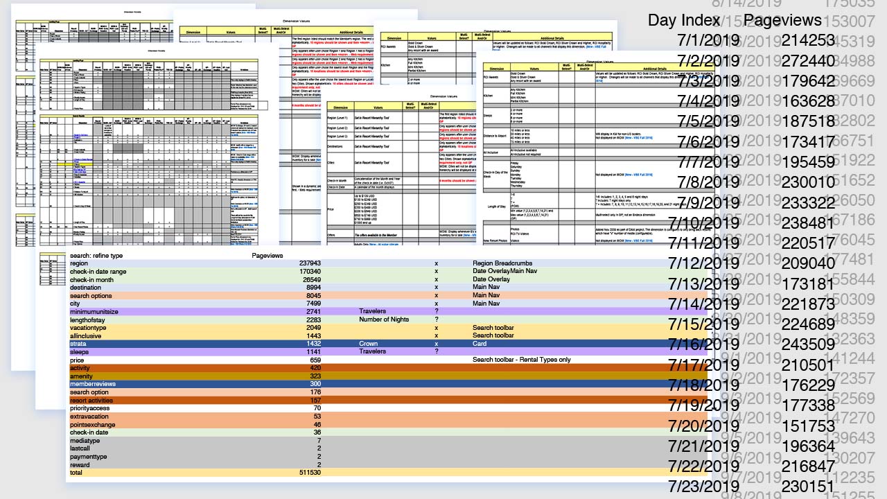
User and System Data
The Clubs Search Project came about after much research and data gathering by the Business Analytics team. There were significant business challenges and years of compounding "solutions" that exasperated users. I met with them to review all the data and suggestions they came up with. Having good, meaningful data is key, and I was exceedingly impressed with the level of detail they were able to provide me.
This was a complex and highly collaborative project, so I want to acknowledge here the vast "behind-the-scenes" work my colleagues provided.
Defining Success and Failure
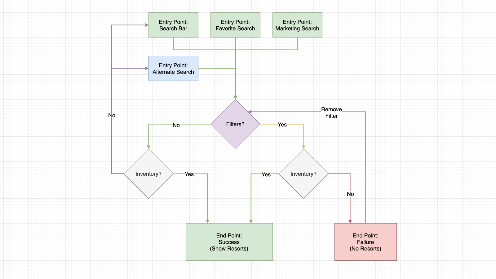
Defining Success and Failure states allowed me to consider all the potential user journeys and "close the loop." My primary vision for the User Experience was to remove any dead ends users might encounter by empowering them to act, fail, and recover quickly.
Due to the rich user data we had and the clear definition of business objectives, I was able to craft this vision. While it may look simple, there are layers and layers of business rules and requirements, but the user should not be burdened by them.
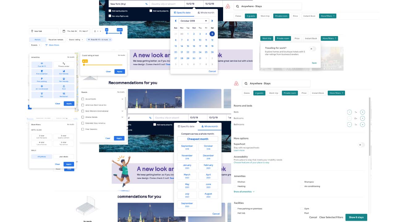
Competitor / Peer Research
It is important to take context into account. RCI is not the only travel company providing these services to customers, so I did research to validate common use cases and design patterns.
While there was much overlap, there were plenty of deviations simply because the business model and products offered were different. Reusing what is familiar allows more brainpower for users to use during unfamiliar interactions.
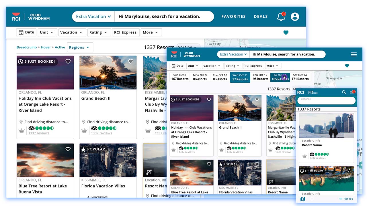
Grid Layout
I designed the product grid to use an infinite scroll pattern while the header, toolbar, and map remained stationary. This allowed all the important information to be presented upfront, while the dynamic information had room to grow. I opted for vertical cards within three columns to allow for easy browsing with multiple options visible at once.
Map Layout
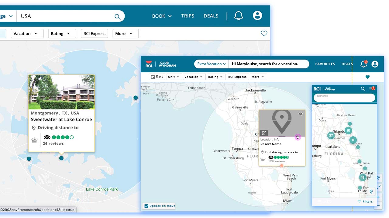
Having a map was not new to the experience, but I wanted to give it more attention. As people have gotten used to apps like Google Maps, a map can feel more intuitive. This feature was made for our "Dreamer" persona, so they could explore the world to see what was available without being weighed down by a grid of detailed information.
In order to help facilitate this further, I wanted the option of going full screen with the map. To make discovery easier at the vertical (zoom) level, I designed the use of clickable clustering. This would remove clutter and zoom closer to the selected area. At the closest level, users would interact with a dot and that specific resort card would appear.
Streamlined Interactivity
Significant research was done to understand how users wanted to explore the resort catalog. I separated the search inputs into priority tiers and placed them in specific locations. Tier one items, such as the destination input, were placed in the main header. More widely used filters were elevated to the top level of the secondary toolbar. Lower tier filters were moved to a "More" dropdown.
Product Card
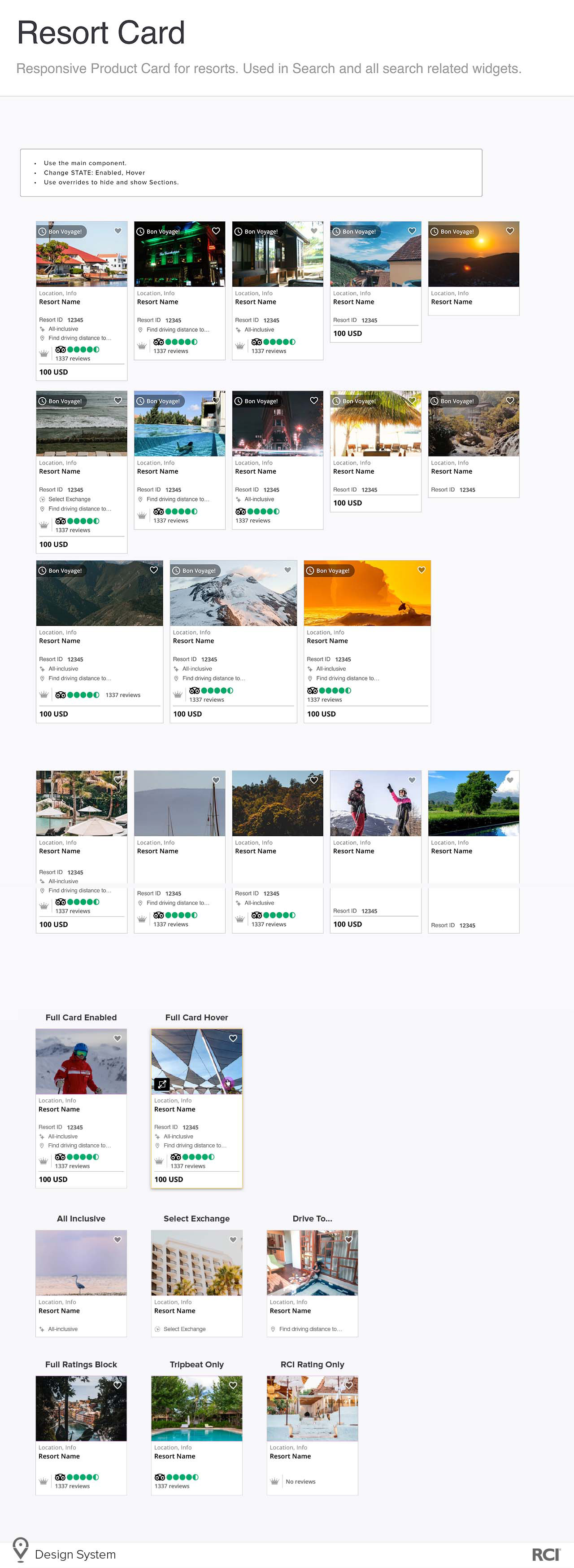
I wanted to standardize the Product Card for use across the entire site. All the cards shown are variations of the same card component/symbol. I made it part of our Design System library, so it could be easily configured and reused.
The purpose of the card is to provide vital and relevant information to the user to help them choose a resort. Again, after much research and data analysis, I chose what should stay and what should be moved further down the user path.
Specification Sheets
I design components and layouts like I would program them. This allows for an easy hand-off and builds that meet expectations. I prefer to give a page layout and a set of states for a component to minimize confusion and provide detailed interaction instructions.
Clicking the Card
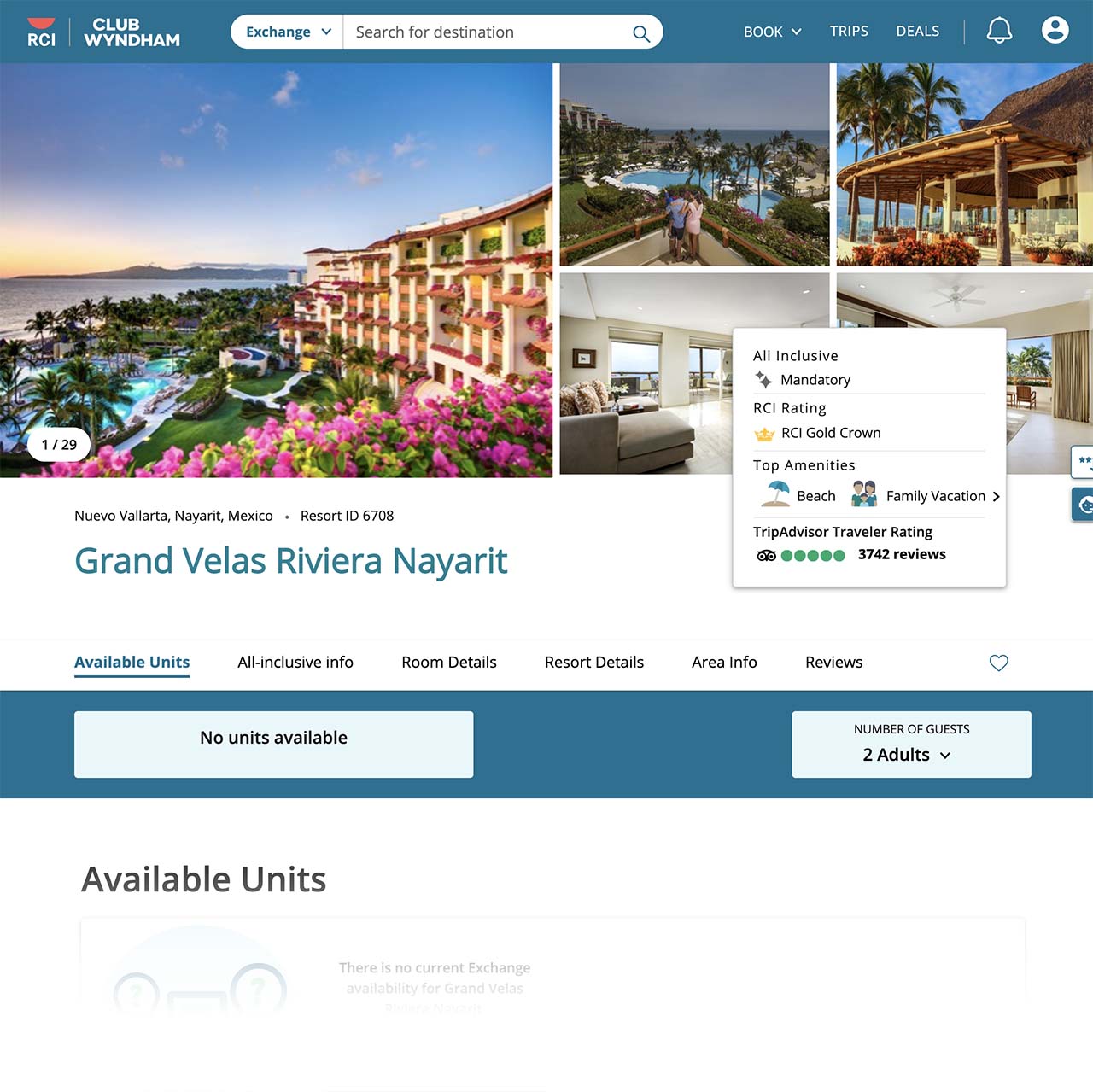
Interacting with a card causes the Available Units page to open in a new tab on desktop and in the same tab on mobile. This was done intentionally in order to accommodate the user behaviors common to those specific device types. I moved much of the original search page functionality over to this page because it made more sense.
A talented coworker on the design team used our Design System to create this incredible next step in the user's journey.