The updated experience contributed to measurable revenue and engagement lifts during holiday periods while supporting repeat campaign use.
Design Systems Lead • 2015–2017
$7.7 Million
Revenue generated
1.4 Million
Visits
-35%
Bounce Rate
The Challenge
The holiday catalog needed to inspire gift discovery while reducing friction for families who were shopping directly from campaign traffic.
The Solution
Designed a dual-path experience balancing inspiration and speed-to-cart, then iterated IA and interaction patterns around seasonal merchandising needs.
Service Scope
UX Strategy
Interaction Design
Front-End Architecture / Development
Conversion Optimization / CRO
The Last Big Book of Toys
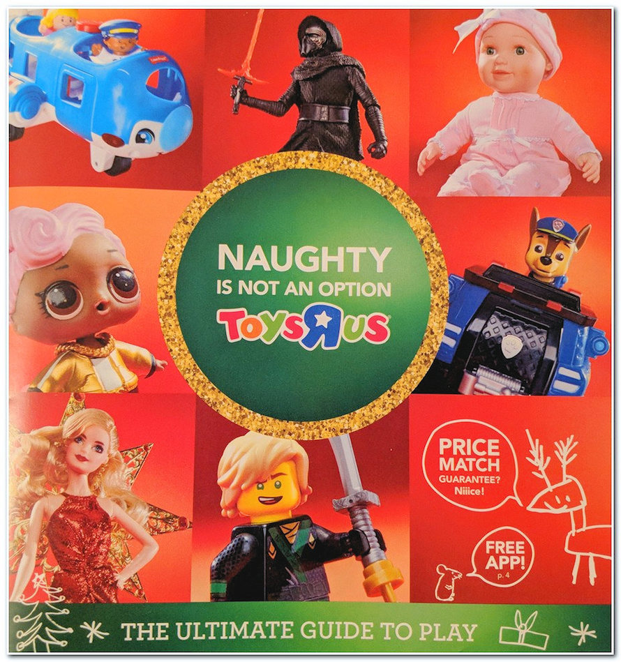
Big Book 2017 was a 180-page printed catalog packed with toys. Families would use these catalogs to curate gift ideas for the Christmas season.
The Primary Task
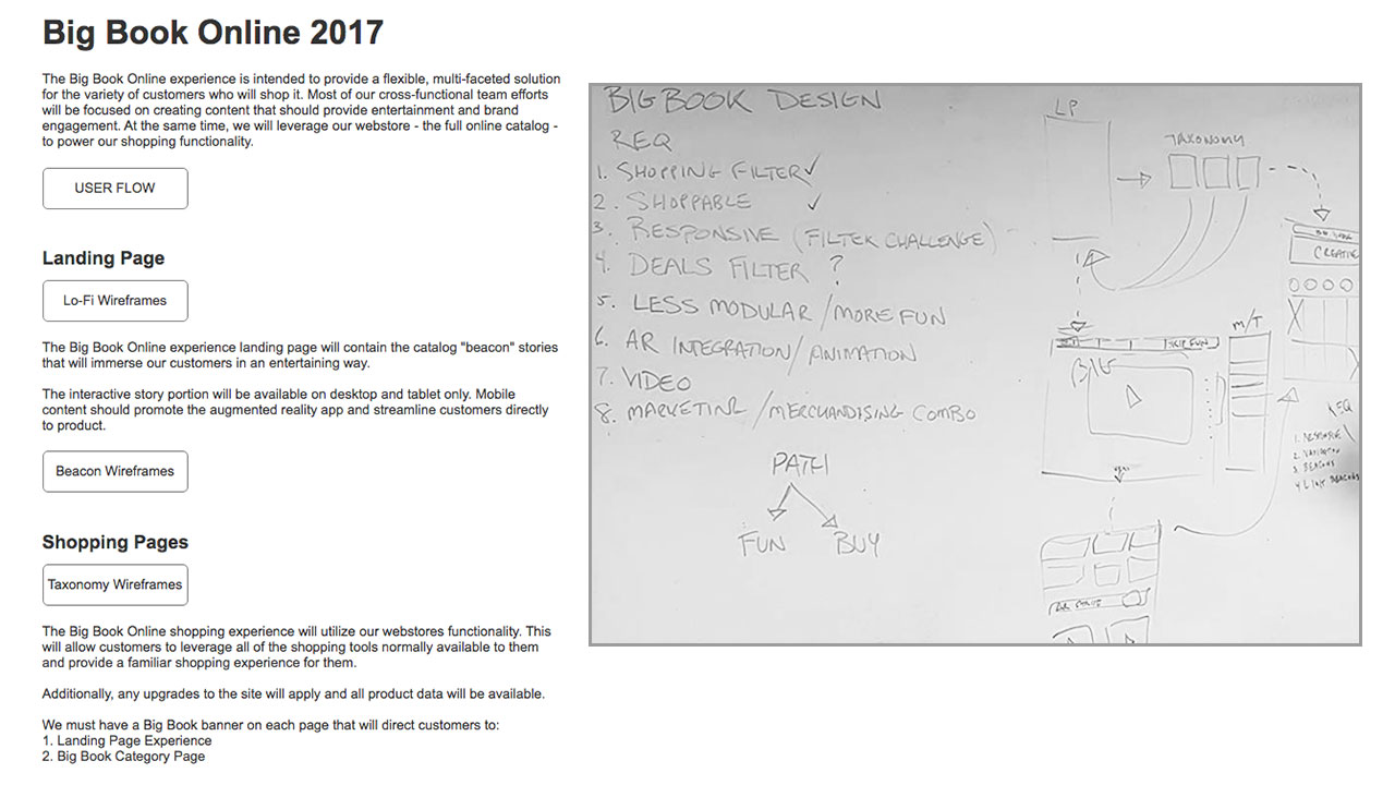
Our goals were to translate this printed catalog into a digital shopping experience and provide an integrated entertainment experience.
The Initial Plan
I had the opportunity to lead the project as the UX Design lead, UI Design consultant, and Manager of the web development team. I worked very closely with our Marketing, Merchandising, Creative, and Web Dev teams to bring Big Book to life.
Who this is for...
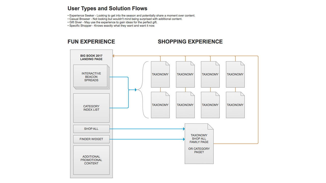
With user data acquired from past Big Book experiences, we identified four types of users. In order to accommodate the desires of these users, we opted for a dual-path approach: the "fun" experience and the "shopping" experience.
Even though we have two seemingly separate experiences, I wanted to ensure that both were interconnected at multiple touch points so any user could pivot at any time between the two.
Starting at the top
Our Creative team designed beautiful splash pages called Beacons. These Beacons acted as major categorization elements that highlighted the most desired toy types.
Bringing Beacons to Life
I directed the teams to use CSS animations to save on performance and provide greater flexibility. I worked with our amazing animator to streamline and finalize these playful content animations.
Closing the Loop
Our website was naturally an online catalog. I worked with our Web Operations team to create curated pages that matched the printed catalog, and we connected each page back to our main landing page experience through simple banners at the top of each page.
Doing this allowed us to take full advantage of the site itself and provide an optimal shopping experience that connected to the landing page hub.
Setting up the grid
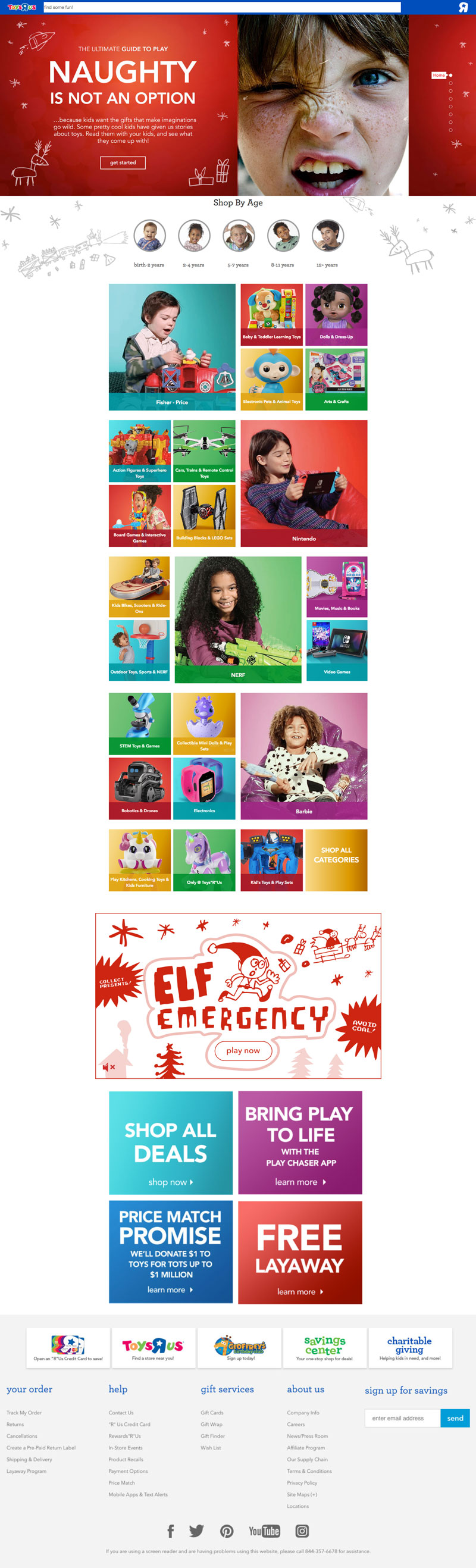
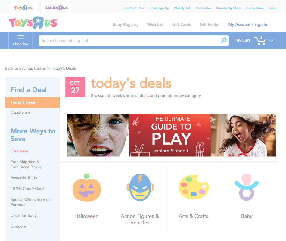
Our "fun" landing page allowed us the opportunity to showcase what kids really want...toys! We used simple animations of children playing to keep the sense of energy and movement, along with our new colorful grid pattern that featured products that zoom in on hover.
All about Play
Mobile View
Mobile View
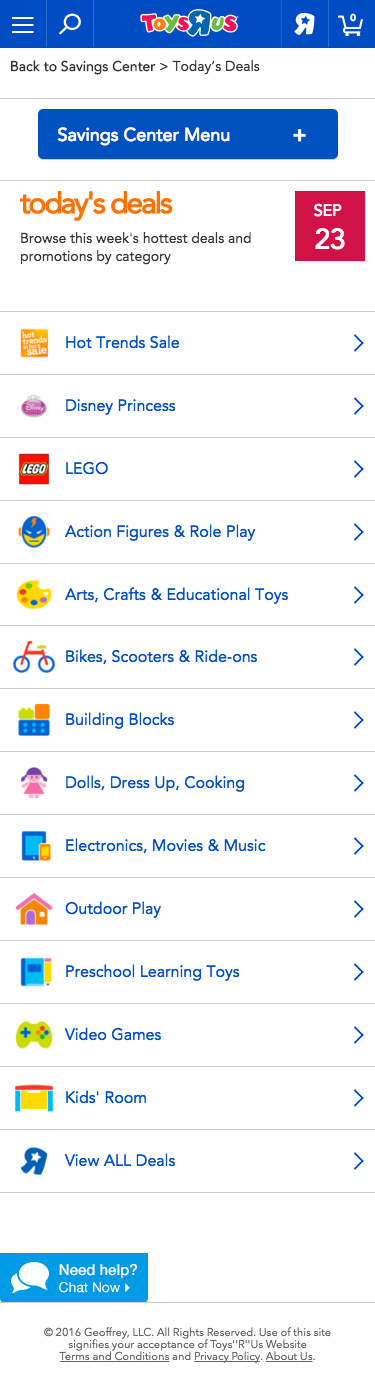
When planning for mobile, we opted for a hybrid of responsive and adaptive design and development. Our mobile users were primarily "power shoppers," but we wanted to make sure they had access while on the go.
This is a snapshot of the entire page in desktop view.
Desktop View
Going beyond
I wanted to do something really engaging with our "fun" experience landing page, so I pitched the idea of a simple runner game to our Creative team. The Big Book catalog was decorated with child-like drawings.
Our team of designers and animators provided the amazing art and audio, while my rock-star web development team built it using HTML Canvas. My role was to conceptualize, strategize, and coordinate the teams as a Director.